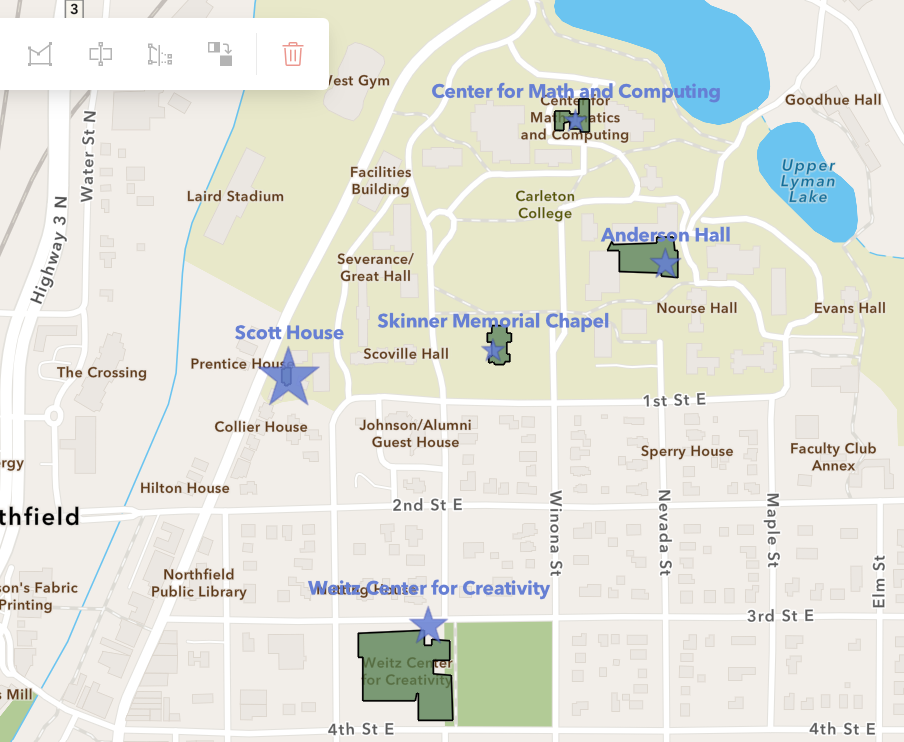
I found the process of digitally mapping with ArcGIS to be generally really intuitive in a lot of ways, but honestly, the interface had some issues. I’m not sure if my version of ArcGIS was just different, but throughout the instructions, many of the buttons and such were either in completely different places, or nonexistent. I was able to figure it out, but finding some settings was just a bit difficult.
However, the general actual processes at play weren’t too bad. For example, adding the CSV file was unbelievably easy, and the program was able to understand the different values and add them to the basemap quickly. Similarly, once I found where to find the option to, customizing the labels and symbology was straightforward and easy to manipulate and make visually appealing.
Web mapping seems like a really exciting option for DH projects. Our entire world exists in a spatial plane, and has since humanity existed, so being able to clearly represent that in a digital manner seems very important to me. I was really pleasantly surprised by the accessibility which ArcGIS provides, and it inspired me a bit to experiment with using digital mapping for personal projects of mine (I’m curious about an archival project mapping some former businesses in Chicago; but I won’t get into it more than that here).
ArcGIS seems like a really useful platform, though some of the tools and general interface aspects aren’t my favorite. Generally, though, the concept of digital mapping in a web-based platform is really wonderful, because it makes the process feel a lot more open to people who might not necessarily be experts. I’m looking forward to possibly using it more in the future, and becoming a bit more familiar with its interface.
Hi Mallory! I totally agree with you that it is quite complicated to start, but pretty straightforward after figuring out where everything is located. I like that you put stars on the buildings that you want to demonstrate, which makes the map visually appealing and the buildings obvious to view. I also like your point that web mapping allows us to display our world in the spatial plane, which makes a more personal connection between the technology and our lives.
Mallory, I really like what you did with the stars and their sizing. I think it creates a very visually appealing and easy map to follow. I agree that ArcGIS, and other GIS platforms in general, can be tricky to naviagte, but I think it is awesome that people like you and me can access these platforms and make these interesting layers.